Avatar
Usage
Presentation
This is the display format for the constructor, designed to showcase what are its capabilities.
Example Basic

This is how it is constructed.
::ShAvatar
---
srcAvatar: https://avatars.githubusercontent.com/u/3258579?v=4
altAvatar: JPC
name: |
    Joaquin Prado
role: |
    Co-Founder
company: |
    Standards-Hub
linkedin: https://www.linkedin.com/in/jpradocueva/
facebook: https://www.linkedin.com/in/jpradocueva/
instagram: https://www.linkedin.com/in/jpradocueva/
twitter: https://www.linkedin.com/in/jpradocueva/
---
::
Props
These are the properties and attributes associated to the constructor:
Properties and Attributes Description
The constructor creates a display format showcasing an avatar that represents a project member, including links to their social media profiles. Below is a detailed description of the properties and attributes used in the constructor.
| Property | Class | Default | Description |
|---|---|---|---|
ui |
n/a | n/a | The ui property in the ShAvatar constructor is a comprehensive configuration object that allows for the customization of various styling aspects of the avatar component. Each attribute within the ui property targets a specific part of the avatar display, providing detailed control over its appearance and layout. Below is a detailed description of each attribute within the ui property: |
wrapper |
config.wrapper |
Defines the overall styling for the container that holds all the elements of the avatar. The attribute shadow-xl is used to provide a shadow effect around the wrapper. |
|
base |
config.base |
A placeholder for additional base styles that can be applied to the avatar component. | |
avatar |
config.avatar |
Styles applied to the avatar image itself, including properties like grayscale effect, rounded shape, and size. | |
socials |
config.socials |
Contains the styles for the social media icons, including their alignment and spacing. | |
icon |
config.icon |
Defines the styling for individual social media icons, including hover effects and transition animations. | |
name |
config.name |
Styles applied to the text displaying the name of the person, such as font size and color. | |
role |
config.role |
Styles applied to the text displaying the role or position of the person. | |
company |
config.company |
Styles applied to the text displaying the company name of the person. | |
srcAvatar |
n/a | n/a | The source URL of the avatar image to be displayed. |
altAvatar |
n/a | n/a | Alternative text for the avatar image, used for accessibility and in case the image fails to load. |
name |
n/a | n/a | The name of the person to be displayed. |
role |
n/a | n/a | The role or position of the person within the company. |
company |
n/a | n/a | The name of the company the person is associated with. |
linkedin |
n/a | n/a | URL link to the person's LinkedIn profile. |
facebook |
n/a | n/a | URL link to the person's Facebook profile. |
instagram |
n/a | n/a | URL link to the person's Instagram profile. |
twitter |
n/a | n/a | URL link to the person's Twitter profile. |
description |
n/a | n/a | Intented to be used as a help to content writter. Doesn`t render on website. |
Example Usage
Advanced Settings
An example with customized ui attributes for enhanced display:
This is an example with customized ui attributes for enhanced display:
::ShAvatar
---
ui:
  wrapper: shadow-xl # provide a shadow around the wrapper
  name: text-3xl # controls text font, size and color
  role: text-2xl
  company: text-xl
  icon: hover:text-blue-800 dark:hover:text-blue-400
  # twitter, facebook, linkedin & instagram are props for links, so no visual effects can be added here
srcAvatar: https://avatars.githubusercontent.com/u/3258579?v=4
altAvatar: JPC
name: |
    Joaquin Prado
role: |
    Co-Founder
company: |
    Standards-Hub
linkedin: https://www.linkedin.com/in/jpradocueva/ #link to social media source
facebook: https://www.linkedin.com/in/jpradocueva/
instagram: https://www.linkedin.com/in/jpradocueva/
twitter: https://www.linkedin.com/in/jpradocueva/
---
::
Config
These style properties can be modified via ui and are stored in the .ts file:
export default {
    wrapper: "grid grid-cols-2 gap-4 p-4 mx-auto w-fit dark:bg-inherit rounded-md",
    avatar: "grayscale justify-self-end tracking-widest rounded-full size-48 dark:border dark:border-primary/[0.6]",
    base: "",
    name: "text-3xl font-bold grow text-primary bottom-0 dark:primary",
    role: "text-lg font-semibold text-black -mt-4 dark:text-gray-400",
    company: "text-lg text-gray-500 tracking-widest -mt-5 dark:text-gray-300",
    socials: "flex text-5xl -mx-1 -mt-4",
    icon: "transition-transform transform hover:-translate-y-1 duration-400 dark:text-primary/[0.6] hover:text-primary dark:hover:text-primary-400",
    // Default Tailwind CSS values
    default: {
    }
  }
Class Descriptions
These represent the class values utilized in the constructor. These values are customizable and can be strengthened or overridden through the ui properties' attributes.
wrapper
- Value:
"grid grid-cols-2 gap-4 p-4 mx-auto w-fit dark:bg-white rounded-md" - Description: This defines the overall styling for the container holding the avatar elements. The value "grid grid-cols-2 gap-4 p-4 mx-auto w-fit" indicates that the
wrapperuses a CSS grid layout with two columns, has a gap of 4 units between grid items, padding of 4 units, and centers the container horizontally with mx-auto and its width is set to fit the content. A "dark:bg-white" setts background to white whne in dark mode and "rounded-md" creates a rounded edges.
avatar
- Value:
"grayscale justify-self-end tracking-widest rounded-full size-48" - Description: This specifies styles for the avatar image. The value "grayscale justify-self-end tracking-widest rounded-full size-48" includes a grayscale effect, right-aligned positioning within the grid (justify-self-end), widest possible letter spacing (tracking-widest), a rounded shape (rounded-full), and a size of 48 units.
base
- Value:
"" - Description: This is an empty placeholder for additional base styles that can be customized if needed.
name
- Value:
"text-3xl font-bold grow text-primary bottom-0 dark:invert" - Description: This defines the styling for the text displaying the person's name. The value "text-3xl font-bold grow text-primary bottom-0" indicates a large font size (text-3xl), bold font weight (font-bold), flexible growth within the container (grow), oma color (text-primary), and positioning at the bottom of its container (bottom-0).
role
- Value:
"text-lg font-semibold text-black dark:text-white -mt-4 dark:invert" - Description: This specifies the styling for the text displaying the role or position of the person. The value "text-lg font-semibold text-black dark:text-white -mt-4" includes a medium-large font size (text-lg), semi-bold font-weight (font-semibold), black text color (text-black) that switches to white in dark mode (dark:text-white), and a top margin of -4 units (-mt-4).
company
- Value:
"text-lg text-gray-500 tracking-widest -mt-5 dark:text-black dark:invert" - Description: This defines the styling for the text displaying the company name. The value "text-lg text-gray-500 tracking-widest -mt-5" includes a medium-large font size (text-lg), gray color (text-gray-500), widest possible letter spacing (tracking-widest), and a top margin of -5 units (-mt-5).
socials
- Value:
"flex text-5xl -mx-1 -mt-2" - Description: This specifies the styling for the container holding social media icons. The value "flex text-5xl -mx-1 -mt-2" indicates a flexible box layout (flex), large icon size (text-5xl), horizontal margin of -1 unit (-mx-1), and top margin of -2 units (-mt-2).
icon
- Value:
"transition-transform transform hover:-translate-y-1 dark:text-black duration-400" - Description: This defines the styling for individual social media icons. The value "transition-transform transform hover:-translate-y-1 dark:text-white duration-400" includes a smooth transformation transition (transition-transform), translation transformation (transform), upward translation on hover (hover:-translate-y-1), white color in dark mode (dark:text-white), and a transition duration of 400ms (duration-400).
default
- Value:
{} - Description: This object is intended to hold any default Tailwind CSS values that might be used as fallback or initial styles.
These style properties ensure that the component is visually appealing and flexible, allowing for a wide range of customization to meet specific design requirements.
FAQs
Q: What are these style properties (base, socials, icon, avatar) and how can we manipulate them?
We can manipulate all four of these through the ui styling (ui.base, ui.socials, ui.icon & ui.avatar). These are some examples of how some effects will be displayed targeting different class:
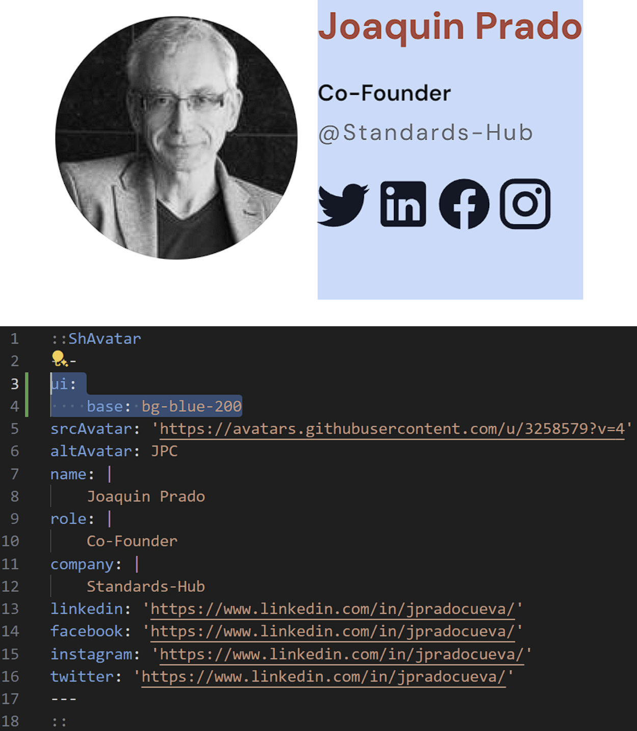
- ui.base
Here and in the next class, ui.socials, we will just color the background of what is wrapped by them, so you will have a visual representation that may give you some ideas on how you can manipulate these classes further
Note: The values for styling of the base have no default style since they have a minor impact on the overall looks. However, it is a good option to have if we want to add some padding, margins, translate or anything else to the colored section on the picture below.
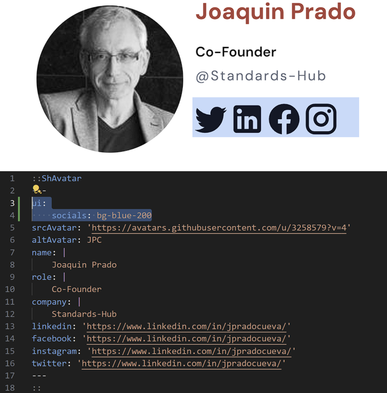
- ui.socials
Here is the visual representation of what is wrapped by ui.socials
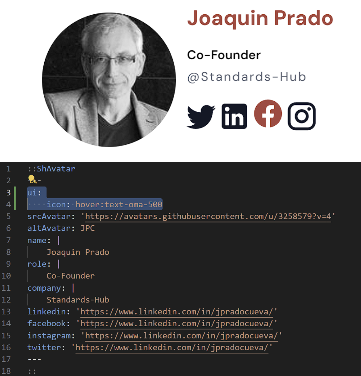
- ui.icon
Here we can add a certain color (we have added hover:text-primary) to the icons that will take place, in this case when we hover over them (see Facebook icon)
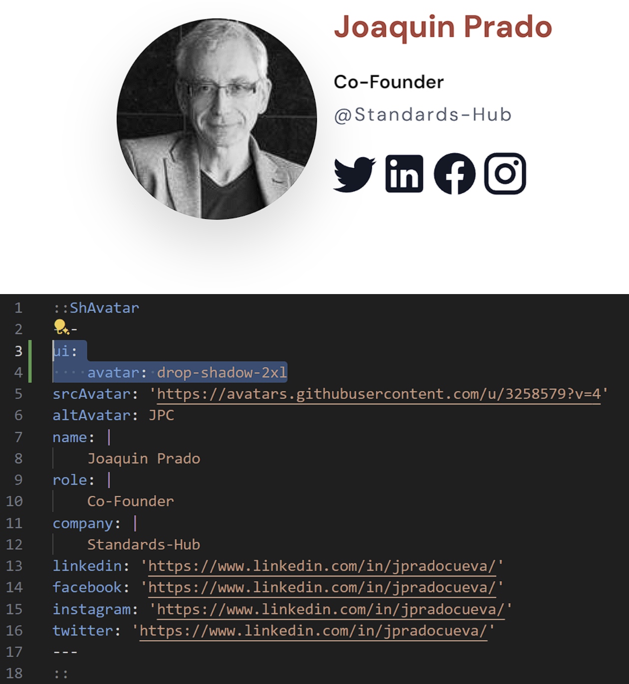
- ui.avatar
Here we can also apply some styles, but since we used grayscale for color of avatar, we are limited with colors. So here, we have added some shadow below avatar (drop-shadow-2xl)
Q: What is Nuxt?
It is a progressive Vue framework