Micro Card
Usage
When using links (anchors) in this component, use either urlWrapper or create a link from title, subtitle or text.
Do NOT combine both as it can result in undesired effects.
Presentation
This is the display format for the constructor, designed to showcase what are its capabilities.
Example Basic
This is how it is constructed
::ShMicroCard
---
urlWrapper: https://www.nasa.gov/
target: _blank
icon: lineicons:nasa
title: |
  NASA
subtitle: |
  Explore the Universe
text: |
  NASA explores the unknown in air and space, innovates for the benefit of humanity, and inspires the world through discovery.
---
::
constructor also comes with a layout option:
The layout: flat does NOT support coverImage, coverIcon nor coverText props.
The layout: cta does NOT have a urlWrapper. Instead, use urlButton
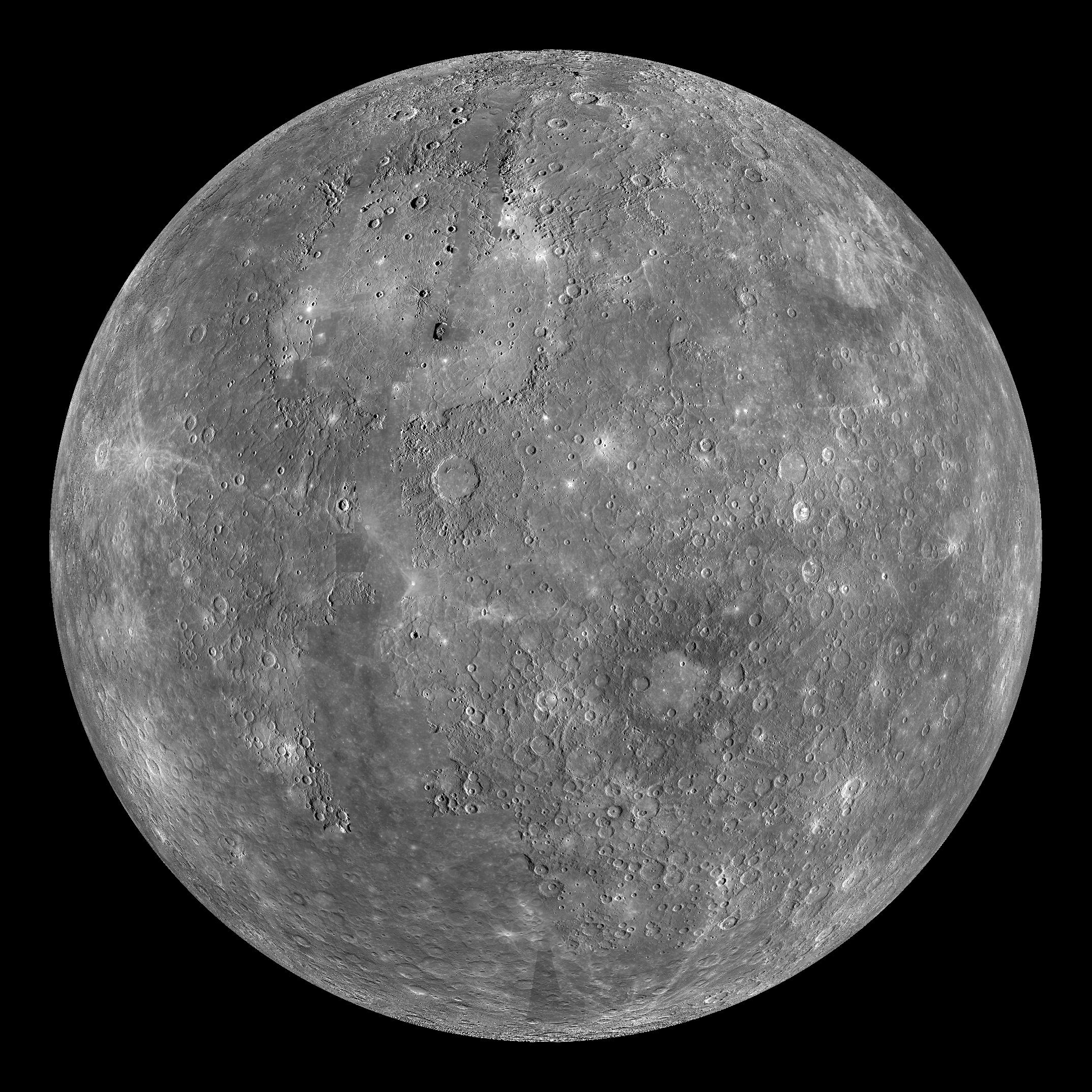
Mercury
God of Translators and Interpreters
The smallest planet in our solar system and nearest to the Sun, Mercury is only slightly larger than Earth's Moon.
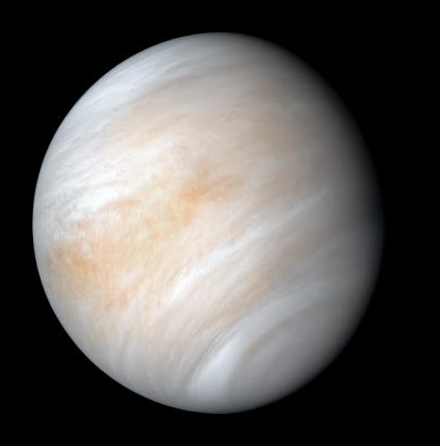
Venus
How hot is too hot?
Venus is the second planet from the Sun, and the sixth largest planet. It’s the hottest planet in our solar system.
::ShMicroCard
---
layout: translate
coverImage: https://science.nasa.gov/wp-content/uploads/2023/11/mercury-messenger-globe-pia15162.jpg
#coverIcon: lineicons:nasa
#coverText: NASA Mercury
icon: game-icons:planet-core
urlWrapper: https://science.nasa.gov/mercury/
title: |
  Mercury
subtitle: |
  God of Translators and Interpreters
text: |
  The smallest planet in our solar system and nearest to the Sun, Mercury is only slightly larger than Earth's Moon.
---
::
::ShMicroCard
---
layout: opacity
coverImage: https://science.nasa.gov/wp-content/uploads/2023/05/venus-single.png?w=398
#coverIcon: lineicons:nasa
#coverText: NASA Venus
icon: fa6-solid:user-astronaut
urlWrapper: https://science.nasa.gov/venus/
title: |
  Venus
subtitle: |
  How hot is too hot?
text: |
  Venus is the second planet from the Sun, and the sixth largest planet. It’s the hottest planet in our solar system.
---
::
Earth
The Blue Marble
Earth – our home planet – is the third planet from the Sun, and the fifth largest planet. It's the only place we know of inhabited by living things.
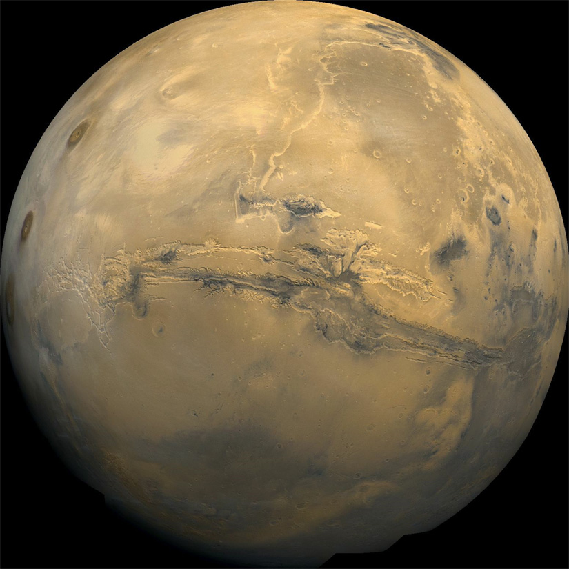
Mars
Meet the neighbour
Mars is the fourth planet from the Sun, and the seventh largest. It’s the only planet we know of inhabited entirely by robots
::ShMicroCard
---
layout: flat
icon: gis:earth-euro-africa-o
urlWrapper: https://science.nasa.gov/earth/facts/
title: |
  Earth
subtitle: |
  The Blue Marble
text: |
  Earth – our home planet – is the third planet from the Sun, and the fifth largest planet. It's the only place we know of inhabited by living things.
---
::
::ShMicroCard
---
layout: teaser
coverImage: https://scx2.b-cdn.net/gfx/news/hires/2015/interestingf.jpg
#coverIcon: lineicons:nasa
#coverText: NASA Mars
icon: token-branded:safemars
urlWrapper: https://science.nasa.gov/mars/
title: |
  Mars
subtitle: |
  Meet the neighbour
text: |
  Mars is the fourth planet from the Sun, and the seventh largest. It’s the only planet we know of inhabited entirely by robots
---
::
NASA
Beyond the Frontier
::ShMicroCard
---
layout: cta #short from Call To Action
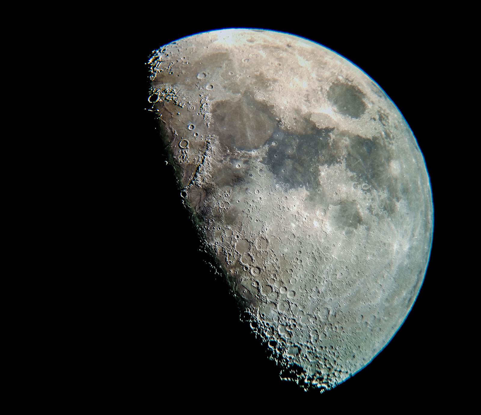
coverImage: https://moon.nasa.gov/rails/active_storage/blobs/redirect/eyJfcmFpbHMiOnsibWVzc2FnZSI6IkJBaHBBczBEIiwiZXhwIjpudWxsLCJwdXIiOiJibG9iX2lkIn19--5cd8ec175a88e67be34ecfc8fe179be81b0a7561/176_moon_2018-04-23-Tom_Campbell_1600.jpg
#coverIcon: lineicons:nasa
#coverText: NASA The Moon
icon: streamline-emojis:new-moon
urlButton: https://science.nasa.gov/moon/
target: _blank
title: |
The Moon
subtitle: |
Earth`s Companion
text: |
From lighting up our skies to maintaining a geological record of our solar system’s history, Earth’s closest celestial neighbor plays a pivotal role in the study of our planet and our solar system.
---
::
::ShMicroCard
---
layout: logo
coverImage: https://gpm.nasa.gov/sites/default/files/document_files/NASA-Logo-Large.png
#coverIcon: lineicons:nasa
#coverText: NASA The Moon
icon: lineicons:nasa
urlWrapper: https://www.nasa.gov/
target: _blank
title: |
  NASA
subtitle: |
  Beyond the Frontier
---
::
Saturn
Ring Of Power
Saturn is the sixth planet from the Sun, and the second largest in the solar system. It’s surrounded by beautiful rings.
::ShMicroCard
---
layout: snap
#coverImage: https://gpm.nasa.gov/sites/default/files/document_files/NASA-Logo-Large.png
coverIcon: simple-icons:saturn
#coverText: NASA The Moon
icon: lineicons:nasa
urlWrapper: https://science.nasa.gov/saturn/
target: _blank
title: |
  Saturn
subtitle: |
  Ring Of Power
text: |
  Saturn is the sixth planet from the Sun, and the second largest in the solar system. It’s surrounded by beautiful rings.
---
::
Props
These are the properties and attributes associated to the constructor:
Properties and Attributes Description
The constructor represents a micro card that can shocase a company logo with some punchlines and lighter descriptions. Whole card can be a link to a certain location or website. Below is a detailed description of the properties and attributes used in the constructor.
| Property | Attribute | Default | Description |
|---|---|---|---|
ui |
n/a | n/a | The ui property in the component is a configuration object that allows customization of various styling aspects of the component. Each attribute within the ui property targets a specific part of the component display, providing detailed control over its appearance and layout. Below is a detailed description of each attribute within the ui property: |
wrapper |
config[layout]wrapper
| Defines the overall styling for the container that holds all the elements of the component. | |
coverImage |
config[layout]coverImage
| Defines the styling for the cover image that spans across the whole constructor | |
coverText |
config[layout]coverText
| Defines the styling for the cover text (including the color of the background) that spans across the whole constructor | |
coverIconWrapper |
config[layout]coverIconWrapper
| Defines the styling for the wrapper of the coverIcon component |
|
coverIcon |
config[layout]coverIcon
| Defines the styling for the icon used for covering the constructor | |
image |
config[layout]image
| Styles applied to the image element, including properties like size and border radius. | |
icon |
config[layout]icon
| Styles applied to the icon element, including properties like size and border radius. | |
title |
config[layout]title
| Styles applied to the title text, such as font size and color. | |
subtitle |
config[layout]subtitle
| Styles applied to the subtitle text, such as font size and color. | |
text |
config[layout]text
| Styles applied to the text content, such as font size and color. | |
layout |
n/a | default |
This property allows us to change layout of a constructor which in effect has that our styling is changing and we get different look and effect out of the same component. Options: default, flat, teaser, snap, translate, opacity, cta & logo |
urlWrapper |
n/a | n/a | The URL that wraps the component, typically for navigation purposes. |
target |
n/a | _self |
Specifies where to open the linked document. |
coverImage |
n/a | n/a | Link to external or internal image that will be presented as a cover across the whole constructor |
coverIcon |
n/a | n/a | Any valid icon from Iconify |
coverText |
n/a | n/a | Inscription that will be presented as a cover across the whole constructor (full Markdown support) |
urlImage |
n/a | n/a | The source URL of the image to be displayed. |
altImage |
n/a | n/a | Alternative text for the image, used for accessibility and in case the image fails to load. |
icon |
n/a | n/a | Any valid icon from Iconify |
title |
n/a | n/a | The title text to be displayed. |
subtitle |
n/a | n/a | The subtitle text to be displayed, if any. |
text |
n/a | n/a | The main text content to be displayed. |
clipboard |
n/a | false |
To show or not the copy button on hover over. It can either be true or false |
description |
n/a | n/a | Intented to be used as a help to content writter. Doesn`t render on website. |
Example Usage
Advanced Settings
An example with customized ui attributes for enhanced display:

This is an example with customized ui attributes for enhanced display:
::ShMicroCard
---
ui:
  default: #if other layout is selected, then its name must be here
    title: text-red-500
    text: text-oma-purple-300
urlImage: https://assets-global.website-files.com/5e19ea5aa7d3a217492e372b/624de949df5a11680ab170b9_Axios%20logo%20-%20RGB%20-%20minimum%20space.png
urlWrapper: https://www.axios.com/
title: |
  Microsoft sets non-profit to cut software related carbon emissions.
subtitle: |
  Axios gets you smarter, faster on what matters.
text: |
  This is a representation of additional field for text, if it is needed. It also has a *full Markdown capability*.
---
::
Config
These style properties can be modified via ui and are stored in the .ts file:
export default {
  default: {
    wrapper: "container overflow-hidden relative group flex flex-col rounded-2xl pl-4 pr-4 pb-4 pt-4 mx-auto max-w-md w-full h-full justify-items-center text-center hover:shadow-lg hover:scale-105 duration-300 border-2 bg-golden/[0.4] border-golden/[0.6] hover:border-golden dark:bg-neutral-700 dark:border-neutral-600 dark:hover:border-golden",
    coverImage: "absolute mb-0 bottom-0 left-0 w-full h-full object-fill opacity-100 ease-in-out z-40",
    coverText: "absolute inset-0 flex items-center justify-center text-center ease-in-out dark:bg-neutral-800 bg-white opacity-100 z-40",
    coverIconWrapper: "bg-white dark:bg-neutral-800 absolute inset-0 w-full h-full object-cover z-40",
    coverIcon: "absolute inset-0 w-full h-full object-cover opacity-100 ease-in-out z-40",
    image: "relative mt-4 w-full h-auto flex shrink mx-auto z-20",
    icon: "relative sm:mt-4 flex shrink-0 mx-auto text-[3rem] dark:saturate-[300%] mb-8 z-20",
    title: "title text-2xl font-extrabold dark:saturate-[300%] break-words z-20",
    subtitle: "subtitle text-lg font-bold dark:saturate-[180%] mt-3 break-words z-20",
    text: "text font-light text-[1.3rem] mt-7 break-words z-20",
  },
  flat: {
    wrapper: "container overflow-hidden relative group flex flex-col rounded-2xl p-4 mx-auto max-w-md w-full h-full justify-items-center text-center bg-transparent dark:bg-transparent",
    image: "relative mt-4 w-full h-auto flex shrink mx-auto z-20",
    icon: "relative sm:mt-4 mb-8 flex shrink-0 mx-auto text-[4rem] dark:saturate-[300%] z-20",
    title: "title text-2xl font-extrabold dark:saturate-[300%] break-words z-20",
    subtitle: "subtitle text-lg font-bold dark:saturate-[180%] mt-1 break-words z-20",
    text: "text font-light text-[1.3rem] mt-9 break-words z-20",
  },
  teaser: {
    wrapper: "container overflow-hidden relative group flex flex-col rounded-2xl p-4 mx-auto max-w-md w-full h-full justify-items-center hover:shadow-lg duration-300 border-2 bg-golden/[0.4] border-golden/[0.6] hover:border-golden dark:bg-neutral-700 dark:border-neutral-600 dark:hover:border-golden",
    coverImage: "absolute inset-0 w-full h-full object-cover opacity-60 z-0",
    coverText: "absolute inset-0 flex items-center justify-center text-center ease-in-out opacity-100 z-10",
    coverIconWrapper: "absolute inset-0 w-full h-full flex items-center justify-center z-0",
    coverIcon: "absolute inset-0 w-full h-full object-cover opacity-30 duration-500 z-0",
    image: "relative mt-4 w-full h-auto flex shrink mx-auto z-20",
    icon: "relative sm:mt-4 mb-8 flex shrink-0 mx-auto text-[3rem] dark:saturate-[300%] transition-transform duration-500 ease-in-out group-hover:translate-y-[-0.3rem] transform z-20",
    title: "title mt-16 text-center text-2xl font-extrabold dark:saturate-[300%] break-words z-20 transition-transform duration-500 ease-in-out group-hover:translate-y-[-2rem] transform",
    subtitle: "subtitle text-center font-bold dark:saturate-[180%] text-[1.3rem] opacity-0 group-hover:opacity-100 transition-opacity duration-500 ease-in-out mt-1 break-words z-20 transition-transform group-hover:translate-y-[-1.1rem] transform",
    text: "text text-center text-[1.1rem] opacity-0 group-hover:opacity-100 transition-opacity duration-500 ease-in-out font-medium mt-2 mb-5 break-words z-20",
  },
  snap: {
    wrapper: "container overflow-hidden relative group flex flex-col rounded-2xl p-4 mx-auto max-w-md w-full h-full justify-items-center hover:shadow-lg duration-300 border-2 bg-golden/[0.4] border-golden/[0.6] hover:border-golden dark:bg-neutral-700 dark:border-neutral-600 dark:hover:border-golden",
    coverImage: "absolute inset-0 w-full h-full object-cover opacity-60 z-0",
    coverText: "absolute inset-0 flex items-center justify-center text-center text-2xl font-extrabold opacity-30 scale-100 transition-all duration-700 ease-in-out group-hover:translate-y-[45%] group-hover:scale-[0.8] group-hover:opacity-100 group-hover:dark:saturate-[180%] z-10",
    coverIconWrapper: "absolute inset-0 w-full h-full flex items-center justify-between z-0 overflow-hidden",
    coverIcon: "absolute inset-0 w-full h-full object-cover opacity-30 scale-100 transition-all duration-700 ease-in-out group-hover:-translate-y-[6rem] group-hover:scale-[0.2] group-hover:opacity-100 group-hover:dark:saturate-[300%] group-hover:-mt-9 z-0",
    icon: "relative sm:mt-4 mb-8 flex shrink-0 mx-auto text-[3rem] dark:saturate-[300%] transition-transform duration-500 ease-in-out group-hover:opacity-0 group-hover:transition-opacity group-hover:duration-500 transform z-20",
    title: "title mt-32 text-center text-2xl font-extrabold dark:saturate-[300%] break-words z-20 transition-transform duration-500 ease-in-out group-hover:translate-y-[-2rem] transform",
    subtitle: "subtitle text-center font-bold dark:saturate-[180%] text-[1.3rem] opacity-0 group-hover:opacity-100 transition-opacity duration-500 delay-300 ease-in-out mt-1 break-words z-20 transition-transform group-hover:translate-y-[-1.1rem] transform",
    text: "text text-center text-[1.1rem] opacity-0 group-hover:opacity-100 transition-opacity duration-500 delay-200 ease-in-out font-medium mt-2 mb-5 break-words z-20",
  },
  translate: {
    wrapper: "container overflow-hidden relative group flex flex-col rounded-2xl pl-3 pr-3 mx-auto max-w-md w-full h-full justify-items-center text-center border-2 border-golden/[0.6] hover:border-golden dark:border-neutral-600 dark:hover:border-golden",
    coverImage: "absolute mb-0 bottom-0 left-0 w-full h-full object-cover transition-transform duration-700 group-hover:-translate-y-full z-40",
    coverText: "absolute inset-0 flex items-center justify-center text-center dark:bg-neutral-800 bg-white transition-transform duration-700 group-hover:-translate-y-full z-40",
    coverIconWrapper: "bg-white dark:bg-neutral-800 absolute inset-0 w-full h-full object-cover transition-transform duration-700 group-hover:-translate-y-full z-40",
    coverIcon: "absolute inset-0 w-full h-full object-cover opacity-100 ease-in-out z-40",
    image: "relative mt-4 w-full h-auto flex shrink mx-auto z-20",
    icon: "relative sm:mt-4 mb-8 text-[4rem] dark:saturate-[300%] flex shrink-0 mx-auto z-20",
    title: "title text-xl font-extrabold dark:saturate-[300%] break-words z-20",
    subtitle: "subtitle text-base font-bold dark:saturate-[180%] mt-3 break-words z-20",
    text: "text font-light text-[1.1rem] mt-7 break-words z-20",
  },
  opacity: {
    wrapper: "container overflow-hidden relative group flex flex-col rounded-2xl pl-3 pr-3 mx-auto max-w-md w-full h-full justify-items-center text-center border-2 border-golden/[0.6] hover:border-golden dark:border-neutral-600 dark:hover:border-golden",
    coverImage: "absolute mb-0 bottom-0 left-0 w-full h-full object-cover opacity-100 ease-in-out transition-opacity duration-700 group-hover:opacity-0 z-40",
    coverText: "absolute inset-0 flex items-center justify-center text-center dark:bg-neutral-800 bg-white opacity-100 ease-in-out transition-opacity duration-700 group-hover:opacity-0 z-40",
    coverIconWrapper: "bg-white dark:bg-neutral-800 absolute inset-0 w-full h-full object-cover opacity-100 ease-in-out transition-opacity duration-700 group-hover:opacity-0 z-40",
    coverIcon: "absolute inset-0 w-full h-full object-cover opacity-100 ease-in-out z-40",
    image: "relative mt-4 w-full h-auto flex shrink mx-auto z-20",
    icon: "relative sm:mt-4 mb-8 text-[4rem] dark:saturate-[300%] flex shrink-0 mx-auto z-20",
    title: "title text-xl font-extrabold dark:saturate-[300%] break-words z-20",
    subtitle: "subtitle text-base font-bold dark:saturate-[180%] mt-3 break-words z-20",
    text: "text font-light text-[1.1rem] mt-7 break-words z-20",
  },
  cta: {
    wrapper: "container overflow-hidden relative group flex flex-col rounded-2xl p-4 mx-auto max-w-md w-full h-full justify-items-center text-center border-2 bg-golden/[0.4] border-golden/[0.6]",
    coverImage: "absolute inset-0 w-full h-full object-cover opacity-60 dark:opacity-60 z-0",
    coverText: "absolute inset-0 flex items-center justify-center text-center opacity-60 z-0",
    coverIconWrapper: "absolute inset-0 w-full h-full flex items-center justify-center z-0",
    coverIcon: "absolute inset-0 w-full h-full object-cover opacity-60 z-0",
    image: "relative mt-4 w-full h-auto flex shrink mx-auto z-20",
    icon: "relative text-start sm:mt-4 mb-8 flex shrink-0 text-[3rem] z-20",
    title: "title text-4xl text-start font-extrabold dark:saturate-[300%] text-black dark:text-golden break-words z-20",
    subtitle: "subtitle text-2xl text-start font-bold dark:saturate-[180%] text-black dark:text-golden mt-1 break-words z-20",
    underline: "underline underline-offset-[1.5rem] decoration-2 dark:decoration-golden/[0.4]",
    text: "text mt-8 font-light text-[1.1rem] text-start text-neutral-800 dark:text-golden break-words z-20",
  },
  logo: {
    wrapper: "container overflow-hidden relative group flex flex-col rounded-2xl pl-3 pr-3 mx-auto max-w-md w-full h-full justify-items-center text-center border-2 border-golden/[0.6] hover:border-golden dark:border-neutral-600 dark:hover:border-golden",
    coverImage: "absolute mb-0 bottom-0 left-0 w-full h-full object-contain bg-white transition-transform duration-700 group-hover:-translate-y-full z-40",
    coverText: "absolute inset-0 flex items-center justify-center text-center dark:bg-neutral-800 bg-white transition-transform duration-700 group-hover:-translate-y-full z-40",
    coverIconWrapper: "bg-white dark:bg-neutral-800 absolute inset-0 w-full h-full object-cover transition-transform duration-700 group-hover:-translate-y-full z-40",
    coverIcon: "absolute inset-0 w-full h-full object-cover opacity-100 ease-in-out z-40",
    image: "relative mt-4 w-full h-auto flex shrink mx-auto z-20",
    icon: "relative sm:mt-4 mb-8 text-[8rem] dark:saturate-[300%] flex shrink-0 mx-auto z-20",
    title: "title text-xl font-extrabold dark:saturate-[300%] break-words z-20",
    subtitle: "subtitle text-base font-bold dark:saturate-[180%] mt-3 break-words z-20",
    text: "text font-light text-[1.1rem] mt-7 break-words z-20",
  }
}
Class Descriptions
This constructor has many classes in many layouts, so this description section would be exagerated with information about each class. Checkout the official TailwindCSS documentation.